Hi, hello! Well, it’s June. Inexorably the months come and then they go. Doesn’t seem to matter what else is going on, the calendar days keep flipping over.
One of the card-making/giving occasions in June is Father’s Day and Technique Tuesday has curated a collection of masculine themed stamps and dies for your shopping convenience. Besides Father’s Day though, are any number of other reasons to make and give a masculine card and sometimes those can be a little extra challenging, amirite? Whatever the occasion, Technique Tuesday has you covered! Using a few different stamp/die sets, I made three cards and a traveler’s notebook layout that I want to share with you today.

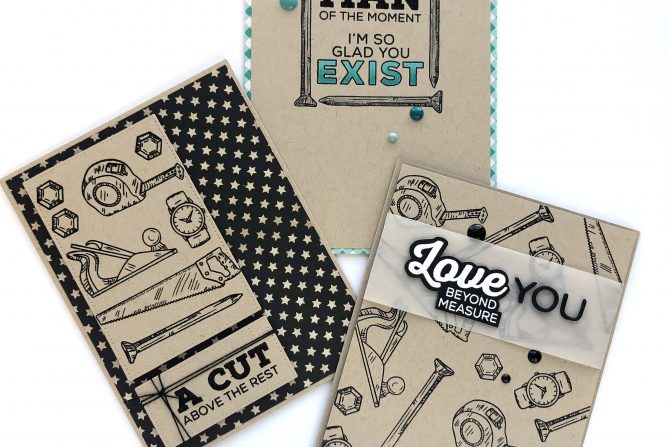
I used the What A Guy stamp set (it has a matching die set but I didn’t use it this time) to make these three cards. I went with a masculine color combo of kraft, black and a pop of teal green.

For my first card, I stamped each of the images in the stamp set a couple of time to loosely cover a card panel with an all-over design. I stamped with Versafine Onyx Black ink and heat set with clear embossing powder. Each of the icons in this stamp set has a corresponding punny greeting and I used the sentiment that matches the watch for this card because I really liked that sentiment.

I stamped the sentiment onto black cardstock and mimicked the look of a shadow die cut by fussy cutting around the words. I added the “you” with die cut and stacked alphabet letters from Sizzix and Tim Holtz. Then, as is often the case on an all-over design, I found the background a little too busy and it was competing with the greeting, so I popped them up with foam tape and adhered them to a strip of vellum paper. That’s a trick that often saves the day!

Next up is a card that uses all the same stamp images once (or three times for the bolt) stamped in a tidy graphic, blocky design. That made it easy to die cut the block and pop it up with more foam tape.

Then I added the sentiment block. Do you see how the sentiment alone is much smaller than the die cut block? None of the sentiments in the set would have filled the block any better so I used the trick of “gift wrapping” the block with black cotton thread to visually balance the whole greeting block. It makes for a much more visually pleasing card design.
Are you wondering where I found such perfectly matched-to-the-kraft-cardstock star paper? Well, I had some great black and WHITE star patterned paper in my stash but it just didn’t look good with the stamped kraft blocks, so I used a Copic marker the exact color of kraft cardstock to fix the problem by coloring over the whole card panel!

For my third card, I stamped the square frame using the nail image in the What A Guy stamp set and then decided which sentiment to use. The “Man of the Moment” worked, along with the “I’m so glad you exist” sentiment from the Nancy and Nick the Narwhals stamp set.

I used colored pencils to fill in the nail images as well as the open letters in the greeting, blending three shades of blue/green for the word “exist”. I cropped the card panel slightly to mat the card panel with some plaid patterned paper that matched the color of the sentiment, and supported that color scheme with three enamel dots in light to dark shades.

Lastly, I made a traveler’s notebook layout using elements from the Travel Buddy stamp set and the Travel Icons die set.

I stamped four of the images in the Travel Buddy stamp set, with Versafine Onyx Black ink onto Neenah Solar White cardstock and heat set with clear embossing powder. Then I used the coordinating Captions and Labels Dies to die cut the stamped images. I lined them up along the side to create a balanced and continuous line for the eye to follow from photos to die cuts going left to right.

On the bottom left corner of the left hand page, I die cut the silhouette shape of the signs in the Travel Icons Dies set. I die cut four layers and stacked them together to give them more heft as an embellishment.

Other elements I used on this page are Felicity Jane paper (grey/green), Webster’s Pages paper (woodgrain), Altenew (dotted) and Hobby Lobby (striped) washi tape, Studio Calico circle dots wood veneer, grey label tags and “makes me happy” die cut, Illustrated Faith enamel hexagon shapes, Freckled Fawn label sticker and finally, Michael’s Recollection alphabet stamps to create the title. I have long admired this Range Rover car, so it’s a dream come true to be driving one now!
Thanks so much for stopping by and have a great day!


