Hey, hi! Today is another Better Late Than Never post and I have some lovely things to share with you! At the risk of sounding like a broken record, I couldn’t participate in the blog hop for the GinaK August release because my package was MIA, but it finally found it’s way to me and I’m sorry, but these stamp sets are just WAY too pretty to not sit down and play with right now! There are three different stamp sets I’m going to share projects from over the next few days, but today I’m focusing on the Delightful Blooms stamp set, illustrated by Arjita Singh!

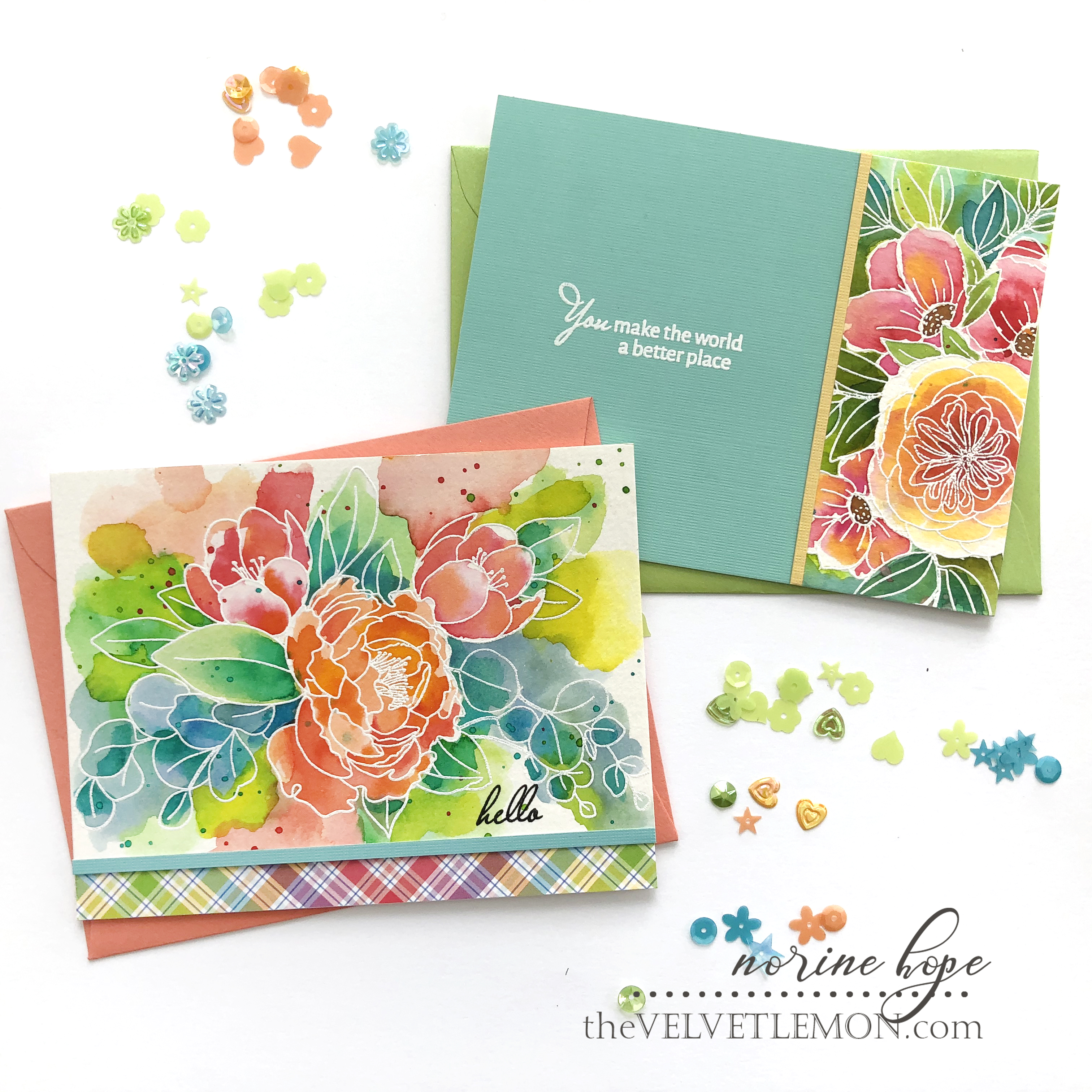
Aren’t these first two cards just a fruit cocktail salad of color!!? Not the typical toned-down, elegant colors you often see here, but I love them just the same! The nice people at Viviva Colorsheets sent me a package of 16 watercolor paint colors in the most compact little booklet you ever did see and I decided to use them for this project!

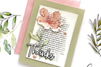
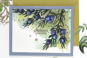
I began by stamping both of the beautiful bouquets in the Delightful Blooms stamp set onto watercolor paper with embossing ink and heat setting with white embossing powder.

Painting over and around white lines is a technique I especially love to do when I don’t plan to paint carefully and mindfully, just splashing color in the general area of where I want it and dragging the paint out over the lines to help them show up.

In the case of this 1980’s Florida Keys Decor colored card, I just wanted to play with the paint palette and see what they produced straight from the booklet and brush without any (much) color mixing. After laying down an initial layer of color, I did go back and add more layers of color and shadows here and there.

The second card is done the same way, by stamping onto watercolor paper and white heat embossing then painting the flowers and leaves in the design. To be honest, I needed to pull back on the Boom Chicka Wow Wow! impact of the whole card panel of painted color, so I cut a small strip from the center of the design and balanced it out with a solid colored piece of textured cardstock.

Both of the sentiments on these sherbet-y colored cards are from the Delightful Blooms stamp set, and because I was stamping onto textured paper, I used a stamp positioning tool so that I could be assured of the possibility of stamping a second time if the first time produced a less than perfect result!

The painting part of these designs was very straightforward. The booklet contains 16 super vivid colors of highly pigmented watercolor paint. The patches of paint are so intense that you have to paint a sample swatch below each one to see what it’s true color is. I had an acrylic paint palette at hand so that I could mix puddles of color with lots of water to dilute the colors as necessary, so you know that what seems like a small patch of paint will go a long way! Even though it might not be my usual color palette, I do love the way these cards turned out and I can’t wait to paint with them again!

However, lest you think that these are a One Trick Pony kind of product, let me show you what they can do if you want to play around with color mixing and blending!
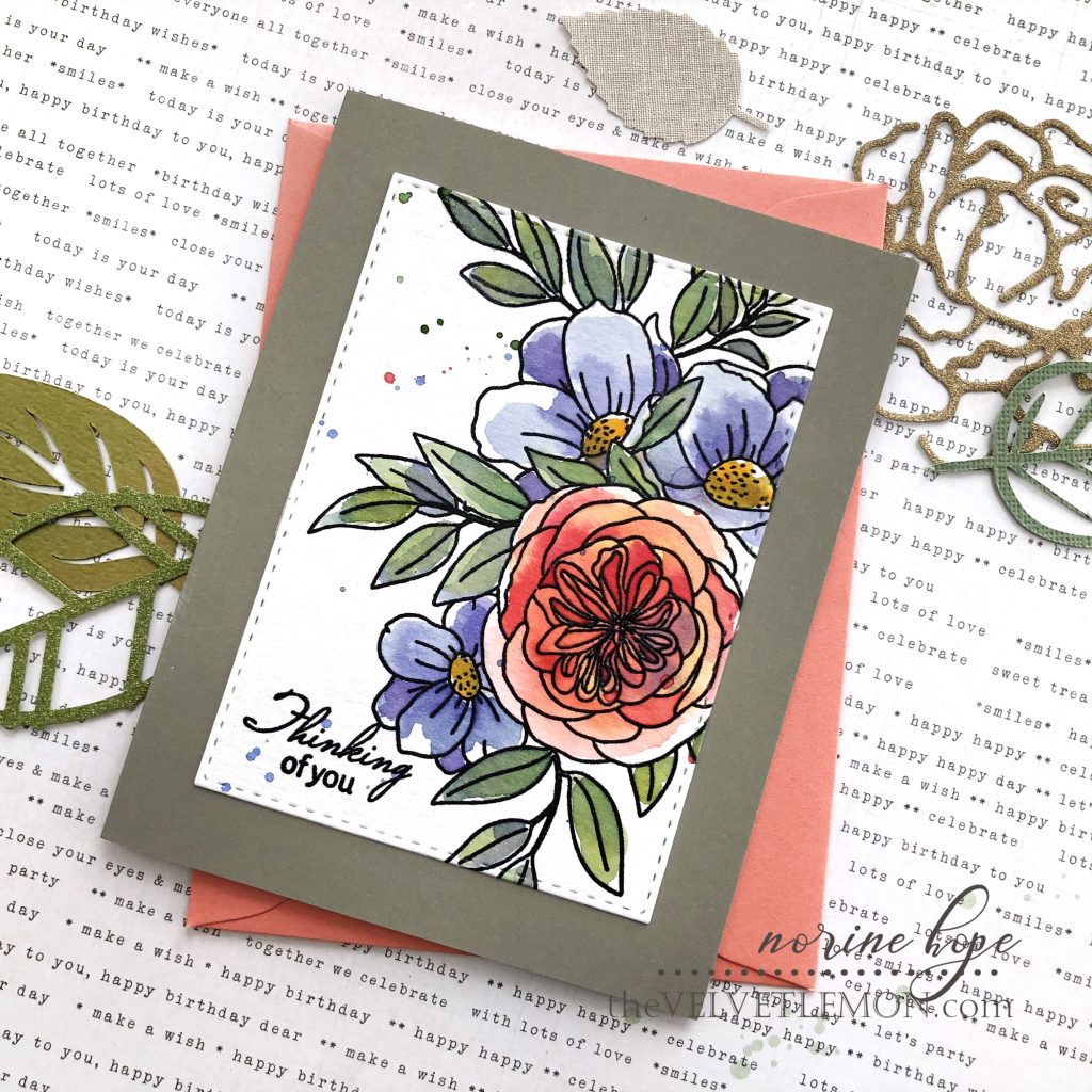
These two cards are the same stamp images (I can’t get enough of these gorgeous bouquets!) as the cards above, and are stamped on watercolor paper again, but this time with black ink and clear embossing powder to heat set.

When I stamp with black to produce a strong outline image I can paint in the colors more realistically. Is that the right word to describe it? The technique for the first cards above is messy and artsy, with color everywhere and sometimes not in the “right” places, but this way of painting is more “correct”.

I mixed the paint colors on my acrylic palette, adding cool tints to warm, and toning colors down with the addition of a little black, to achieve these shades that are more realistic.

I used plenty of water in the painting as well, to allow the color to blend and flow, but I started with a very light color in each of the different areas, then went back and added more pigment for a deeper or more complex shade of color. But I love how the vibrancy of the paints is still evident, shining through the paints like they’re lit from behind!

Both stamped and painted panels are cropped using stitched dies and are stamped with sentiments from the Delightful Blooms stamp set and heat embossed. And in all cases, a painted card of mine isn’t finished until it has some paint splatters!
Thank you so much for stopping by! I always appreciate your interest and enthusiasm for my cards, and I hope your find some inspiration for your own paper crafting! Have an amazing day!